Creating a Funder-Ready Nonprofit Website: Best Practices and Key Elements
In today's digital age, your nonprofit’s online presence is a decisive factor in your success. The first thing people do—including donors and funders—is google your nonprofit. And what they see can make the difference between getting funding or being placed in the “no pile.”
More likely than not, your website is the first thing that will come up in a Google search. So, a well-designed website serves as a virtual calling card. Consider it a powerful tool that can make or break your nonprofit's ability to attract funding and support.
In this article, we will look into the concept of a “funder-ready nonprofit website” and explore why it is absolutely essential for nonprofit organizations to prioritize online presence.
I’ll discuss key elements and best practices that will help you create a nonprofit website that's funder-ready. From crafting a compelling narrative to optimizing user experience and incorporating essential features, I’ll share actionable insights to elevate your online presence and position your nonprofit for success.
Whether you're looking to build a website from scratch or planning to revamp your organization's website, this article will serve as your comprehensive guide so you can create a website that not only impresses funders but also empowers your nonprofit to make a meaningful impact on the world.
Table of Contents
- What Is a Funder-Ready Nonprofit Website?
- Why Is It Important to Have a Well-Designed Nonprofit Website?
- Be Clear About Your Nonprofit's Mission and Audience
- Key Elements of a Funder-Ready Nonprofit Website
- Build Trust with Funders
- Best Practices for Creating a Funder-Ready Website
- Frequently Asked Questions (FAQ)
- Make Your Website Funder-Ready
What Is a Funder-Ready Nonprofit Website?
First, let's clarify what the term “funder-ready nonprofit website” means. It is a website that is thoughtfully crafted to resonate with potential funders, donors, and other partners. It should focus on your clients—the people you serve—and show the impact your organization is making.
A funder-ready website goes beyond being merely online brochures. What makes a website funder-ready is that it has all the elements a funder is looking for to determine eligibility:
Mission
Impact
Key personnel
Board members
Physical address
Business number
Professional email
Valuable content (thought leadership)
Resources
Engaging photos
Community partners
Strong calls to action
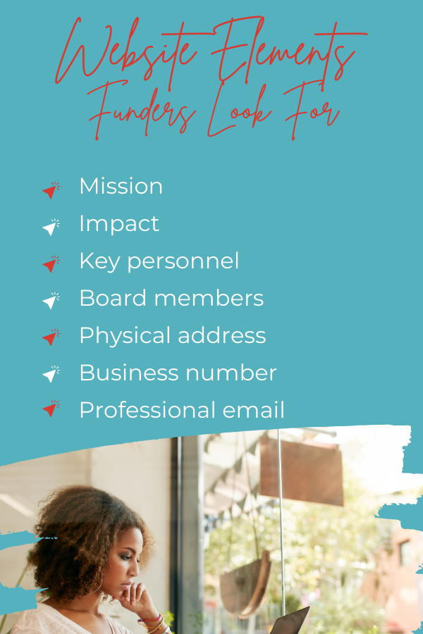
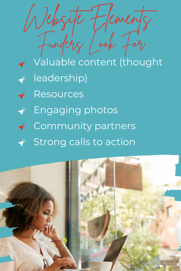
A funder is looking to validate a nonprofit. These things help them to do that.
Why Is It Important to Have a Well-Designed Nonprofit Website?
It might seem obvious—all websites should be well-designed, right?
Yes!
It is even more critical for nonprofits because of the changing landscape of philanthropy and the way individuals, foundations, and corporations decide where to allocate their resources. Donors and funders increasingly rely on the internet to research and vet nonprofit organizations. A poorly designed website, riddled with navigational issues or lacking essential information, can turn off potential supporters.
How can they trust a nonprofit to handle funds when you can’t even spell properly on your website?
So, a funder-ready nonprofit website plays a pivotal role in attracting funders. It serves as a digital showcase of your organization's values, accomplishments, and goals. By strategically presenting your mission, showcasing your impact, and demonstrating financial transparency, your website can be the catalyst that convinces funders to invest in your cause.
What are the benefits of having a funder-ready website aside from getting funded?
The benefits of having a funder-ready website extend far beyond financial support. A well-structured website can:
Enhance your nonprofit's credibility
Expand your reach
Facilitate meaningful engagement with your audience
It can also streamline administrative processes and improve your organization's overall efficiency. In short, a funder-ready website can be a game-changer for your nonprofit.
Be Clear About Your Nonprofit's Mission and Audience
Before you post an ad for a website designer and launch a website revamp project, you must be clear about your nonprofit’s mission and audience.
Crystalize Your Nonprofit's Mission and Goals
You probably know this already, but let’s go over it again so all our bases are covered. Repeat after me: The foundation of a funder-ready nonprofit website begins with a crystal-clear understanding of your organization's mission and goals. Before diving into the intricacies of web design and content, take the time to articulate what your nonprofit stands for and the impact your organization is making in your community.
Your mission statement should be concise, compelling, and reflect the heart of your organization's work. It's not just a statement; it's a guiding beacon for everything you do, including your website.
Here’s a quick example.
❌ Our mission is to make the world a better place. ❌
This mission statement is overly vague and lacks specificity. It provides no insight into the nonprofit's actual goals or the ways in which it plans to achieve its mission. It is so broad that it could apply to virtually any nonprofit organization, making it ineffective at conveying a clear sense of purpose.
✔️Our mission is to combat hunger and food insecurity in our local community by providing nutritious meals to low-income families, educating them about healthy eating habits, and collaborating with local farmers to ensure access to fresh produce. ✔️
This mission statement is specific, focused, and actionable. It clearly defines the nonprofit's purpose (combatting hunger and food insecurity), target audience (low-income families), and the strategies they employ (providing nutritious meals, education, and collaboration with local farmers). This mission statement provides a clear sense of the organization's goals and how it intends to achieve them, making it effective in conveying its impact to stakeholders.
Identify Your Target Audience
I cannot emphasize this enough: You need to know your why.
Why did you start your nonprofit? Why are you doing what you do?
This ties in closely with the who—your audience. Your clients.
This means you have to build a solid infrastructure where you crystalize who you are, what you do, and who you serve. Read more about building your nonprofit infrastructure.
Why is this important? Because your website will focus on them. As I mentioned earlier, your website needs to show the impact your nonprofit is making. And you can’t show your impact if you’re not clear on who you are serving.
Key Elements of a Funder-Ready Nonprofit Website
With your mission and funders in mind, it's time to tailor your website's content and design to create a cohesive and compelling online presence.
Here are the essential elements your website needs to be funder-ready.
1. Professional Platform
People are quick to use free website builders like Wix. It’s tempting—it’s another expense you can save on, right? But here’s why I recommend against using these free platforms when you build your website.
Limited customization: Free website builders often come with restrictive templates and limited customization options. This can make it challenging to create a unique and professional website that effectively represents your nonprofit's brand and mission.
Branding and credibility: Nonprofit organizations rely heavily on trust and credibility. A generic website built on a free platform with ads does not convey the level of professionalism (a website is a basic business expense. If you can’t invest in your biggest branding mechanism, what else are you cutting corners on?) and trustworthiness that potential donors, volunteers, and partners expect.
Lack of control: When you use a free website builder, you are essentially renting space on their platform. This means you have limited control over your website's look and feel, hosting, data, and functionality. If the platform experiences downtime or changes its policies, it could negatively impact your nonprofit's online presence.
Advertising and branding: Many free website builders display their own branding or advertisements on your website, which can detract from your nonprofit's message and mission. It can also create confusion among website visitors, making them question whether your organization is truly dedicated to its cause or simply using a free platform for convenience.
Limited features: As your nonprofit grows, you may find that you need advanced features like e-commerce capabilities, membership portals, or custom forms. Free platforms may not provide the scalability and flexibility your organization requires, keeping your organization from scaling.
Data security and privacy: With a free website builder, you may have less control over the security of your website and the data you collect from donors and supporters. Ensuring the privacy and security of your users' information is essential for building trust.
Long-term cost: While free website builders save money upfront, they may end up costing more in the long run. If your organization outgrows the platform or needs to migrate to a more robust solution, the transition can be time-consuming and costly.
Ownership and data control: When you use a free platform, you often surrender ownership of your website and data to the provider. This lack of control can be problematic if you ever decide to move to a different hosting provider or if the platform ceases to exist.
At the end of the day, the downsides of free website builders do not make your nonprofit look good. They make your organization look unprofessional.
Remember: A nonprofit is a business, and a website is a business expense. It is the public-facing “expression” of your organization. A free website is a poor reflection of the business. "Invest" in the organization and pay for a website!
That being said, what should you do? (Bear with me, as we’re going to get a bit technical.)
1. Choose a domain name
Pick a memorable and relevant domain name that reflects your nonprofit's name or mission. Visitors (including funders) will expect a domain name that is the same as the organization name.
Some organizations use abbreviations (especially if the name is long or taken), others some just MSU that a reasonable person could have never guessed.
Let’s say the nonprofit is “Atlanta Boys Club,’ and their domain is “www.Hello-Boys.org.”
Err…you see how that can complicate things?
It's important for branding/credibility that the domain matches the organization's name.
Doctors Without Borders’ domain, https://www.doctorswithoutborders.org/, is a perfect example.
Notice that that doesn’t end in “.com”? That’s because “.org” is the extension associated with nonprofits. (More on this in the next section.)
2. Register the domain and get web hosting
Once you’ve decided on the domain, you need to register it and get web hosting so you can publish your website. The easiest way to do this is to use Google Workspace. There, you can check if your domain is available and register it. You’ll also get your custom email (with the domain) and other Google Apps.
Now, what if you have a domain that ends in “.com,” “.net,” “.info,” other some other extension? You’re not alone. Many nonprofits don’t use “.org” (yet). The most common explanation I’ve heard from my clients is, "We started off as ‘.com,’ so everyone knows how to find us at this address."
Get a “.org” (Google Workspace), and have an IT person redirect the “.com” to “.org.” Post a "We're Moving!" sign on the website for 90 days to get people used to the “.org,” but keep redirecting the “.com” to the “.org” so people can find you.
3. Select a website platform
Choose a user-friendly website platform like WordPress or Squarespace.
Ensure the platform supports nonprofit features like donation buttons, gallery page, and event calendars.
🤯 Too much? Hire a web design/development professional to do the job for you. I highly recommend my design wizard, Su Jane Lim! Alternatively, check out Acadium and try out their internship program.
Consider it an investment, as it will save you time and avoid complications that may result from a DIY project.
2. Clear and Compelling Homepage
Your homepage is the virtual front door of your nonprofit, and it's where you'll make that all-important first impression on potential funders.
A funder-ready website’s homepage should have—at the very minimum—the following:
A Mission-Driven Headline/Tagline
Your mission should be front and center. Craft a compelling headline or tagline that succinctly conveys your nonprofit's purpose and impact. Make sure it's easily visible and leaves a lasting impression.
Engaging Visuals
Use high-quality images, videos, and graphics that tell your nonprofit's story visually. Share images of your work in action, the people you've helped, or the communities you serve. Visual content can be incredibly persuasive.
⚠️ No stock images, please! ⚠️
Funders are looking for proof of your impact. Why are you using stock images and not photos of your clients? Stock photos make funders question whether or not your organization is actually doing the work.
⚠️ No staged photos, please! ⚠️
Funders want to see the work you're doing in action. Photos of participants holding up certificates don’t “show” your work in action. Photos should give funders a clear idea of the work you do.
Call-to-Action Buttons
Include prominent and eye-catching call-to-action (CTA) buttons that guide visitors to take action. Craft strong and clear CTAs that leave no doubt as to what that action is.
Here are some examples of strong and clear CTAs:
Volunteer Today!
Sign up for the beach clean-up
Sign Our Petition
Join Our Afterschool Program
Support Our Troops
There should be one donate button in the top right-hand corner of the navigation bar that stands out. Too many buttons are annoying and will cause people to click off the website.
Also, I discourage you from using pop-ups on the homepage. Why? A person is visiting your website to get to know you, and before they even have a chance to read about your organization, this pop-up is shoved in their face, saying “DONATE.” Damn, Gina, I don't know you that well. Leave the pop-ups for deeper into the website after the visitor has at least had an opportunity to read about the organization and decide they want to support you!
By focusing on these key elements on your homepage, you'll cater to your clients and provide supporters with a clear path to engage with your organization, whether through financial support or further inquiry.
Nonprofit Homepage Example: girls inc. of Los Angeles
Girls Inc.’s homepage hits all the points.
Girls Inc. Homepage
The tagline: When One Girl Rises, All Girls Rise.
Visuals: Once visitors land on the site, they see a video of young girls entering a door, high-fiving a staff member/volunteer (presumably to attend a program). The rest of the homepage has photos of their participants. No stock photos here!
CTA: You can’t miss that red/pink donate button (on a black background) on the upper right!
3. About Us/About the Organization Page
This page should provide more detailed information about your organization, including your history, mission, vision, and impact.
Your "About Us" or "About the Organization" page is where funders go to dig deeper into your nonprofit's identity and history. It's a pivotal page because funders are seeking to understand the heart and credibility of your organization.
This page serves as a critical bridge between your homepage's initial engagement and deeper understanding. It should leave visitors with a strong sense of who you are, what you've achieved, and why your mission matters. When funders explore this page, they should be inspired by your journey and motivated to explore opportunities for collaboration.
Make sure your About Us page serves as a catalyst for funders to give you the green light by:
Telling Your Nonprofit's Story Effectively
Craft a compelling narrative that tells the story of your nonprofit's journey. Share:
Why your organization was founded
The challenges you aim to address
The long-term vision you're striving to achieve
Note, however, that brevity is your friend. Use storytelling techniques to engage readers emotionally and connect them to your mission but don’t go on and on. This LinkedIn resource is an invaluable tool for honing your storytelling skills.
Showcasing Your Team and Leadership
Introduce the people behind your nonprofit. Highlight key staff members, board members, and leadership. Share their expertise and passion for the cause. Funders want to know who is driving the organization and their qualifications.
Highlight Past Successes and Impact
Provide concrete examples of your past successes and the positive impact you've had on your target audience or community. Use data, testimonials, and case studies to demonstrate the tangible results of your work. This not only builds credibility but also reassures funders that their support will make a difference.
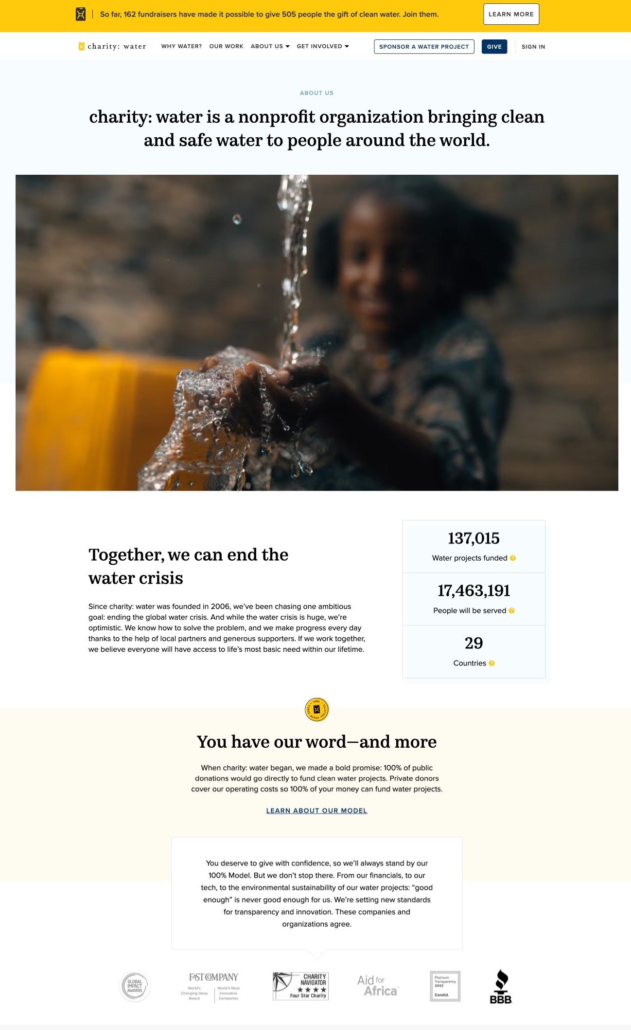
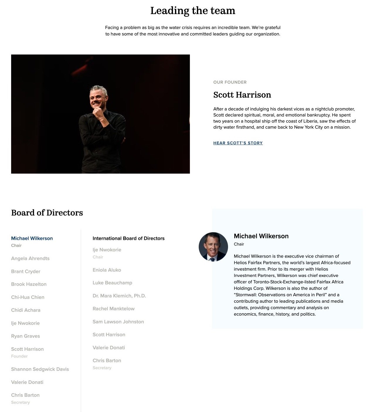
Nonprofit About Us Example: charity: water
charity: water’s About Us page showcases the above points perfectly.
4. Programs and Projects
Showcasing your organization's programs and projects is a pivotal aspect of conveying your mission and impact. Potential funders want to understand not only what you do but also how their support can make a tangible difference.
How do you do this effectively?
Present Your Programs
Clearly and concisely present each of your nonprofit's programs. Include detailed descriptions of their goals, target demographics, and the geographical areas they serve. Use engaging visuals and infographics to make the information easily digestible. Consider organizing this section by categories, making it easy for visitors to navigate and find the programs they are interested in.
Share Success Stories and Testimonials
One of the most compelling ways to demonstrate the real-world impact of your nonprofit is through success stories and testimonials. Share stories about the individuals or communities you serve and highlight the positive changes they've experienced as a result of your programs. Incorporate photos, videos, and personal anecdotes to create an emotional connection. These narratives should underscore the importance of your work and inspire potential funders to get involved.
Share Impact Stories and Statistics
In addition to success stories, create impact stories that provide a broader perspective on the difference your organization is making. These stories should showcase your nonprofit's influence on a larger scale. Discuss measurable outcomes, such as the number of lives improved, communities transformed, or environments restored. Use data and statistics to illustrate the scope of your impact. When funders can see the quantifiable results of their potential contributions, they are more likely to feel confident about investing in your cause.
Demonstrate the Need for Funding in Your Projects
While celebrating achievements is crucial, it's equally important to convey the ongoing need for funding in your projects. Transparency about financial requirements and budget breakdowns is essential. Explain how additional funding can help you expand existing programs, reach underserved populations, or launch new initiatives to address emerging needs. Use visual aids like pie charts or progress meters to illustrate the funding gaps and show how contributions will be allocated.
By effectively presenting your programs, sharing impactful stories, and articulating the ongoing need for financial support, your nonprofit website not only connects with potential funders on a personal level but also demonstrates your organization's commitment to transparency and accountability. This combination of storytelling and data-driven communication is key to creating a compelling and funder-ready website for your nonprofit.
Nonprofit Programs and Projects Example: Black Women for Wellness
Black Women for Wellness has a host of programs, so they provide a summary on their Programs page. It gives basic information for each program and includes links the visitor can click for more information. This is an important point. Do not write long descriptions that go on and on and on. Provide the basic when, where, what, and why. Then provide a "Learn More" button that goes deeper into the description. But keep the first page short and concise.
Doesn’t this look sexy?!
Black Women for Wellness: Programs Page
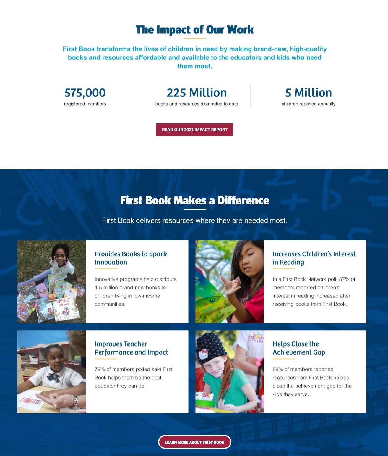
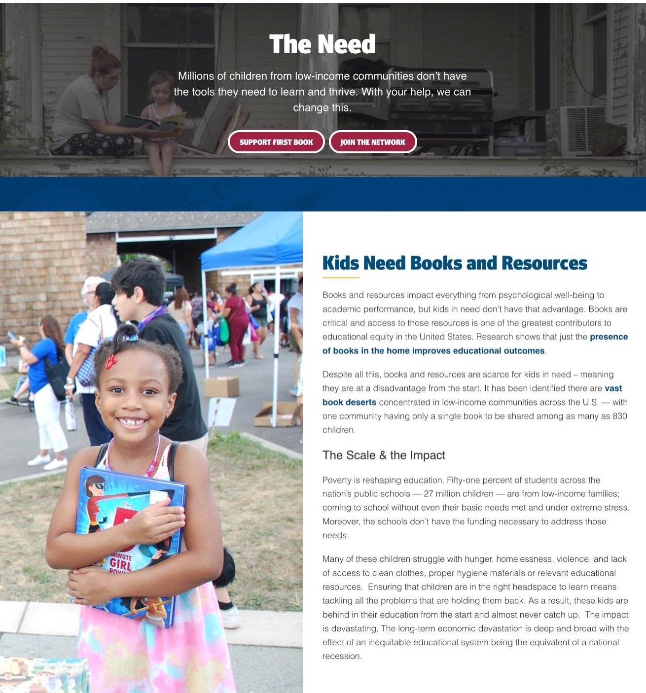
Nonprofit Programs and Projects Example: First Book
First Book is a nonprofit organization dedicated to ensuring that all children, regardless of their background or zip code, can succeed by removing barriers to equitable education.
Their page is a brilliant example of storytelling and demonstrating impact and need.
5. Donations and Fundraising
The success of your nonprofit's mission hinges on your ability to secure financial support from donors. You must make the donation process seamless and instill trust in your supporters.
Here are some essential considerations.
Streamlined Donation Process
Simplicity is key when it comes to encouraging online donations. Ensure that your website provides a straightforward and user-friendly donation process. Visitors should be able to make a contribution with just a few clicks—the fewer, the better. Use a secure and trusted payment gateway to process transactions and offer multiple payment options, including credit cards and PayPal. Eliminate unnecessary barriers to entry, such as mandatory account creation, and provide a guest checkout option for first-time donors.
Transparency in Financial Information
Building trust with potential funders starts with transparency. Dedicate a section of your website to annual reports, as they offer a comprehensive overview of your nonprofit's financial health, program accomplishments, and strategic objectives. Clearly explain how donations are used to support your organization's programs and projects within the context of these reports. Use visual aids like pie charts or graphs to illustrate the allocation of funds. Highlight your commitment to financial responsibility and accountability, demonstrating that you are a trustworthy steward of donor contributions.
Options for Recurring Donations and Matching Gifts
Encourage sustained support by offering options for recurring donations. Allow donors to set up automatic, monthly, or annual contributions, making it convenient for them to support your cause over time. Prominently display your Matching Gift campaign and information on how donors can double their impact with resources like Double the Donation to help them navigate the matching process.
Incorporate clear and compelling calls to action throughout your website, inviting visitors to donate and emphasizing the impact of their contributions. Use engaging visuals, storytelling, and testimonials to reinforce the value of their support. Additionally, consider implementing a donor recognition system to acknowledge and thank your supporters publicly, both on your website and through other communication channels.
By prioritizing a streamlined donation process, financial transparency, and options for recurring donations and matching gifts, your nonprofit website can foster a sense of trust and engagement with potential funders. This not only increases the likelihood of receiving donations but also strengthens your organization's credibility and reputation in the eyes of donors and supporters.
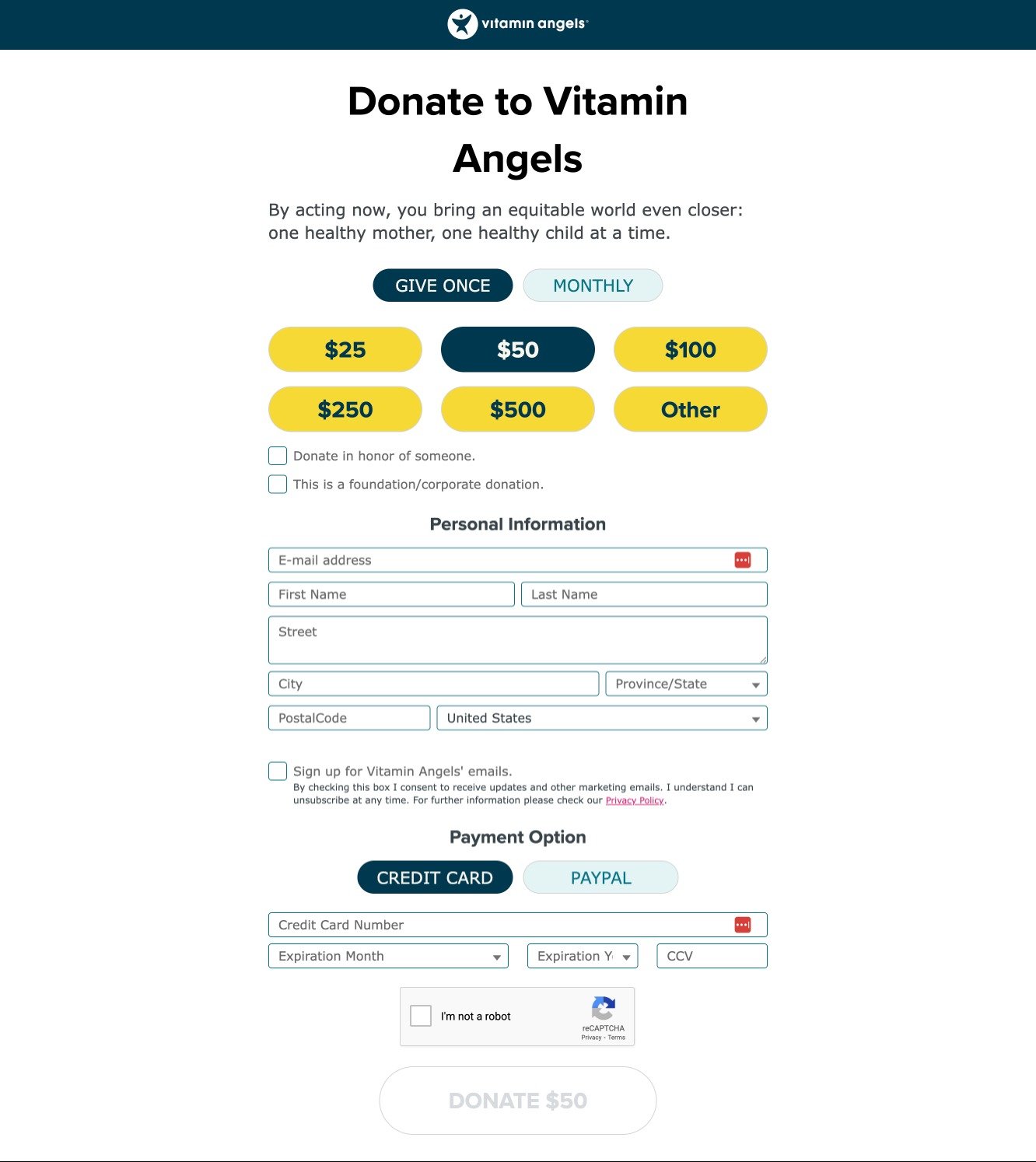
Nonprofit Donate Page Example: Vitamin Angels
Vitamin Angels is a health-focused nonprofit that brings essential healthcare to underserved communities. Their donation page is a stellar example of how nonprofits can make it easy for donors to give different amounts and the option to give monthly or give once.
6. Contact Information and Social Media Integration
Ensuring that potential funders can easily reach out to your nonprofit is crucial for building trust and fostering meaningful connections.
Rule number 1: Make it easy for funders to get in touch with you.
First things first…and I can’t emphasize this enough—it is critical that you provide a physical address. As a public charity, your organization should be readily accessible to the public, not just for funders but also for potential clients and stakeholders. Funders may also wish to conduct site visits, and having a physical location contributes to your authenticity as a public charity.
They are viewing the website through the lens of “How would a potential client access this public charity?” If they only see a PO Box and no physical address, they’re going to think, “How is this a public charity if potential clients can’t access the organization?” 🚩
Besides your nonprofit’s physical address, make sure you provide the following information as well:
Telephone number: Include a telephone number where individuals can reach your organization directly. This allows potential clients and funders to engage with you promptly and with ease.
Email addresses: Provide email addresses for key points of contact within your organization, such as executive directors, program managers, or fundraising leads. This ensures that visitors have direct avenues for communication.
Contact forms: While contact forms are useful, they should complement, not replace, other contact options. Ensure that visitors have multiple ways to get in touch with you, including through traditional email and phone calls.
By making this information readily available, you not only demonstrate your credibility as a nonprofit but also showcase your commitment to transparency and openness as a public charity. Visitors should leave your website with no doubts about how to reach you and engage with your organization.
Don’t forget social media!
There are 302.35 million social media users in the United States—90% of the population! So, to be truly reachable and accessible, you have to integrate your social media accounts into your website.
Include links to your organization's social media profiles, such as Facebook, Twitter, Instagram, and LinkedIn. Regularly update these profiles with your nonprofit's activities, success stories, and relevant news as they demonstrate to funders the myriad of ways your organization engages with the public/your clients. By connecting with your audience through social media, you can build a vibrant online community and keep supporters informed and engaged. Read my guide to social media for nonprofits to learn more.
Remember: A funder viewing your website should find clear evidence of your organization's viability and authenticity as a public charity. Provide comprehensive contact information, including a physical address and telephone number, while integrating social media to enhance your accessibility. By offering multiple ways to connect and engage, you not only meet the needs of potential funders but also strengthen your organization's credibility in the eyes of the public and those seeking your services.
Nonprofit Contact Page Examples
MEND provides food, clothing, and other essential needs for the poor. Their contact page is simple and yet hits all the points above. It provides a physical address and goes one step further by embedding Google Maps. It can’t get more legit than that!
Feeding America’s contact page is comprehensive, which shows all stakeholders—funders included—that the nonprofit is accessible to everyone. It provides physical addresses and phone numbers at a glance but also breaks down different reasons an individual may want to get in touch—help finding food, applying for SNAP, questions about donations, etc.
7. Blog/News Section
Maintaining an active and informative blog or news section on your nonprofit website is an effective way to engage supporters, keep them informed, and establish your organization as a thought leader in your field.
Three things to remember:
1. Publish Regularly
Update your blog or news section no less than once a month to keep supporters and visitors informed about your organization's latest developments, events, and achievements. Share stories about your impact, success stories, and upcoming initiatives. Engage with your audience by sharing on social media and inviting comments, questions, and feedback. This two-way communication fosters a sense of community and involvement among your supporters.
2. Share Updates on Your Organization's Activities
Use this section to provide in-depth insights into your organization's activities. Describe ongoing projects, new partnerships, and milestones reached. Share behind-the-scenes content, such as photos, videos, and interviews with staff and volunteers. These updates not only keep your audience informed but also provide a more personal and transparent view of your nonprofit's day-to-day operations.
3. Demonstrate Thought Leadership in Your Field
Establishing your organization as a thought leader in your field can help attract supporters, funders, and partners who share your passion and vision. Write articles, opinion pieces, and informative content that showcase your expertise and perspective on relevant issues. Provide valuable insights, research findings, and solutions to challenges within your sector. Encourage discussions and debates around these topics to further engage your audience.
Consider including guest contributions from experts in your field to diversify your content and offer fresh perspectives. This not only enhances your credibility but also broadens your reach by tapping into the networks of guest contributors.
To maximize the impact of your blog or news section, incorporate multimedia elements such as images, videos, infographics, and shareable social media links. Again, avoid stock images and use photos from your real-life events. Implement a user-friendly layout and navigation to make it easy for visitors to explore your content and subscribe to updates. By consistently delivering valuable, informative, and engaging content, your nonprofit's blog or news section can become a powerful tool for building and nurturing a loyal community of supporters while positioning your organization as a respected thought leader in your field.
Nonprofit Blog Example: Feeding America’s Hunger Blog
Feeding America’s Hunger Blog aces storytelling and publishes stories regularly. The blog posts are a mix of Feeding America’s activities (Hurricane Idalia response), human interest stories (the story of Bertie Branham, a recipient of the nonprofit’s help, and Ms. Lola, a volunteer), staff highlights, and more.
Build Trust with Funders
When it comes to securing funding for your nonprofit organization, establishing trust is paramount. Funders need to have confidence in your mission, operations, and track record.
You’ve probably noticed that I’ve mentioned trust all throughout the article, and this is because it’s just that important!
Here are a few things to bear in mind to effectively build trust with funders.
One way to instill trust is by prominently displaying trust badges and affiliations on your website. These badges can include recognition from reputable organizations. Guidestar, in particular, is a valuable resource for nonprofits as it provides detailed information about your organization, including financial data, mission statements, and program descriptions. By showcasing Guidestar's recognition or badges from other well-known institutions, you signal to potential funders that your organization meets high standards of transparency and accountability. Claim your profile and consistently update your organization’s information to receive higher ratings.
What about financial reports? Transparency is a key element in building trust with funders. However, I strongly recommend against placing financial reports and other such information on your website. Sure, the public has the right to see them, but there are too many fraudsters. You don’t want to make their lives easy.
The public can access this via Guidestar. Furthermore, provide financial information (including Tax ID) when funders ask for them—which is what will happen if they want to engage.
This approach demonstrates your commitment to open and honest financial practices while protecting you from unscrupulous individuals.
Another way to build trust is to tap into human interest stories. These carry significant weight in building trust. Feature testimonials from individuals who have directly benefited from your nonprofit's programs and services. Share their experiences, highlighting the positive impact your organization has had on their lives. Case studies can further illustrate the effectiveness of your work by presenting real-world examples of how your programs have made a difference. These narratives offer concrete evidence of your nonprofit's ability to fulfill its mission, giving funders confidence in your ability to achieve your goals.
Best Practices for Creating a Funder-Ready Website
Website design and development is no easy feat. It involves considerable tech know-how, and if you’re not trained in this field, it really is best to leave things to the pros. That being said, knowledge is power. And you knowing the basics of what goes into a funder-ready website (tech-side) ensures that you can evaluate if the pros have done a good job.
Website Design and Navigation
A good funder-ready website must have all these elements.
1. Mobile Responsive
In today's mobile-centric world (67.81% of the total web visits are on mobile devices), having a website that's mobile-responsive is non-negotiable. Ensure that your website displays properly for various screen sizes and devices. Mobile responsiveness enhances user experience, making it easy for funders and supporters to access your site and its content on smartphones and tablets.
2. User-Friendly
A cluttered or confusing website can deter potential funders. Implement user-friendly navigation that organizes content logically. Use clear menus, headers, and a well-structured layout to guide visitors to the information they seek. Make it intuitive for users to find your mission, programs, impact stories, and donation options.
Don't write pages of story. Be concise. Write content in third person and EDIT, EDIT, EDIT! Get a professional to review it for clarity. Don't just write stories about nothingness. Everything on the website should be intentional and serve a purpose (to show impact).
3. Consistent Branding and Design
Consistency in branding and design elements helps build trust and recognition. Ensure that your website reflects your nonprofit's branding guidelines, using consistent colors, fonts, logos, and imagery. A cohesive design conveys professionalism and reliability to potential funders. Read my guide on branding for nonprofits for more detailed information.
4. Accessible Content for All Users
Make your website content accessible to all users, including those with disabilities. Follow web accessibility standards, such as WCAG (Web Content Accessibility Guidelines), to ensure that everyone can navigate and understand your website. Provide alternative text for images, use clear and legible fonts, and offer options to adjust text size and contrast.
5. Fast Loading Times and Secure Browsing
A slow-loading website can lead to user frustration and abandonment. Make sure your website quickly loads. Optimize your website for speed by compressing images and using efficient coding practices. Additionally, prioritize security to protect user data and maintain trust. Implement SSL encryption (https://) to ensure secure browsing (including when supporters make donations).
Regularly test your website's performance and functionality across different browsers and devices to identify and address any issues. Solicit feedback from users, including funders, to make continuous improvements.
Incorporating these best practices for website design and navigation not only enhances the user experience but also demonstrates your nonprofit's commitment to professionalism and accessibility. A well-designed, user-friendly, and responsive website can leave a positive impression on potential funders, making them more likely to engage with your organization and support your mission.
SEO and Content Strategy
To ensure that your nonprofit's website effectively reaches potential funders, it's essential to implement a strong SEO (Search Engine Optimization) and content strategy.
Here's how you can do this.
1. Optimize Your Website for Search Engines
Search engine optimization is critical for making your website discoverable to funders and supporters. Implement on-page SEO techniques by optimizing meta titles, descriptions, and header tags. Ensure that your website loads quickly, is mobile-friendly, and has clean, search-engine-friendly code. Utilize SEO plugins and tools to assist in optimizing your website's structure and content.
2. Create Valuable and Relevant Content
Content is the cornerstone of your website's appeal to funders and visitors alike. Regularly publish high-quality, informative, and engaging content that aligns with your nonprofit's mission and goals. This content can include blog posts, articles, videos, infographics, and success stories. By providing valuable information and insights, you not only demonstrate your expertise but also engage and educate your audience.
3. Incorporate Keywords Related to Your Mission and Funding Needs
Keyword research is crucial to SEO success. Identify relevant keywords and phrases related to your nonprofit's mission, programs, and funding needs. Integrate these keywords naturally into your content, including headlines, body text, and meta data. However, avoid keyword stuffing, which can negatively impact your search rankings. Use keywords strategically to increase your website's visibility in search engine results pages (SERPs).
If that went way over your head…
…Get in touch with SEO experts.
Read this article if you want to learn a bit more about SEO for nonprofits.
SEO and content strategy are ongoing efforts. As you continue to refine and expand your website's content, you'll increase your chances of attracting funders and other stakeholders who are actively searching for nonprofits aligned with their interests and goals.
Measure and Improve Website Performance
Ensuring that your nonprofit's website is effective in engaging potential funders requires ongoing monitoring and improvement. Here are things you can ask your tech team to do to measure and enhance your website's performance.
Set up analytics tools. Install tools like Google Analytics to track website performance, including visitor demographics, user behavior, and conversions. Configure them to monitor specific funding-related goals.
Track user engagement and conversions. Monitor metrics such as page views, bounce rates, time spent on pages, and click-through rates on key calls to action. Understand user behavior to identify areas for improvement.
Make data-driven improvements. Use analytics insights to optimize your website. Address conversion bottlenecks, refine content strategy, and improve landing pages. Conduct A/B testing for layout and messaging enhancements. Continuously review data to fine-tune your strategies and user experience.
Frequently Asked Questions (FAQ)
1. What makes a good nonprofit website?
A good nonprofit website is visually appealing, user-friendly, and informative. It effectively communicates your mission, showcases your impact, and provides clear avenues for engagement and support. It should also be mobile-responsive and accessible to all users.
2. What's the first step to improving my nonprofit website?
The first step is to conduct a thorough assessment of your current website. Identify areas for improvement in design, navigation, content, and functionality. Prioritize enhancing transparency and engagement to make your website more appealing to potential funders.
3. How can I build trust with potential funders through my nonprofit website?
To build trust, display trust badges and affiliations, provide transparent financial information, feature success stories and testimonials, and ensure your website is well-organized and easy to navigate. List staff and board members. Offering comprehensive contact information, including a physical address and telephone number, is also crucial.
4. How often should I update the content on my nonprofit website?
Regular updates are essential to keep your website fresh and engaging. Aim for a consistent posting schedule for blogs, news, and success stories. At the very least, once a month. However, prioritize quality over quantity. Ensure that all content aligns with your mission and is relevant to your audience's interests and needs.
Make Your Website Funder-Ready
Creating a funder-ready nonprofit website is crucial for securing essential funding. It builds trust and attracts support by presenting your organization professionally and transparently. Potential funders are more inclined to invest in nonprofits that effectively convey their mission and impact.
Showcase your mission, transparently display financial information, streamline donations, share impact stories, integrate social media, maintain a blog, optimize for search engines, and measure and enhance website performance.
You’ve got the tools. Now, it's time to take action. Commit to continuously improving your website. Your mission deserves nothing less.
Use this Website Audit Checklist to start!
Looking for more ways to expand your donor list? Read “How to Find Donors for Your Nonprofit.”
If you’re looking for an online donation platform, this article will point you in the right direction: “What Is the Best Online Donation Platform for Nonprofits?”


